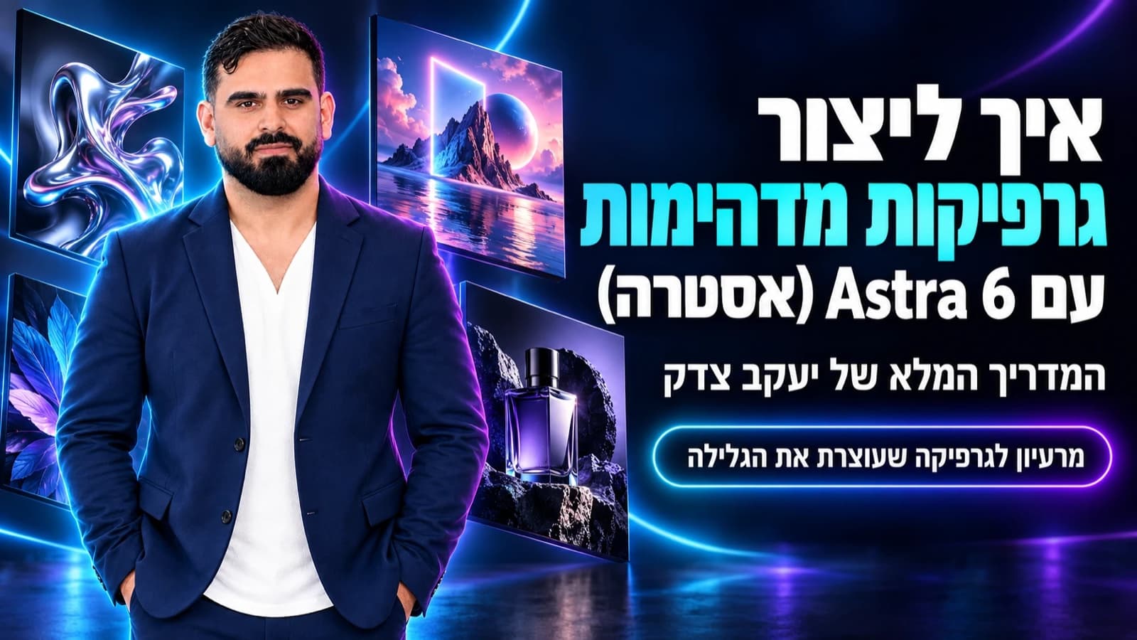
- Yaakov Tzedek's workflow for professional graphics with Astra 6: purpose, composition, hierarchy, brand colors, Hebrew text, lighting, locking what works, and a master prompt template.
Most of the improvement in AI graphics doesn't come from a longer prompt. It comes from locking: preserving exactly what works and changing one variable at a time. That's how a 70% result becomes something you can actually launch in a campaign.
Over the past few weeks I've been generating a huge number of graphics with AI. Ads for campaigns, banners, book covers, Instagram posts, carousels, Facebook covers, SaaS graphics, product mockups, logos, and even complete interface designs.
After a lot of trial and error I arrived at one conclusion: the difference between AI graphics that look "AI" and graphics that look like they came out of a professional studio lies mostly in how you ask for them.
I work today with Astra 6 (the new OpenAI model), and in this guide I want to share my working method. Not a collection of "magic words," but the small things I make a point of asking for again and again, the ones that make an enormous difference in the result.
In short
| Question | Short answer |
|---|---|
| What is the most common mistake? | Asking for "a nice graphic" and letting the model decide on style, colors, text and composition by itself |
| What should you ask for instead? | A brief: goal, format, one idea, composition, exact text, branding, style, lighting and constraints |
| How do you avoid a cluttered graphic? | One hero, one message, one action, and plenty of negative space |
| How do you fix things without breaking them? | Lock what works and change one variable at a time |
| What about Hebrew text in the image? | Exact text in quotes, a strict instruction not to rewrite it, keep it short, and check letter by letter |
| What is the real secret? | Not the tool. The ability to look at a result and say exactly what is wrong |
Examples: graphics I created with Astra 6
Before the method, here is what it looks like in practice. All of the graphics below were created with Astra 6 following the principles in this guide, with no editing in design software.
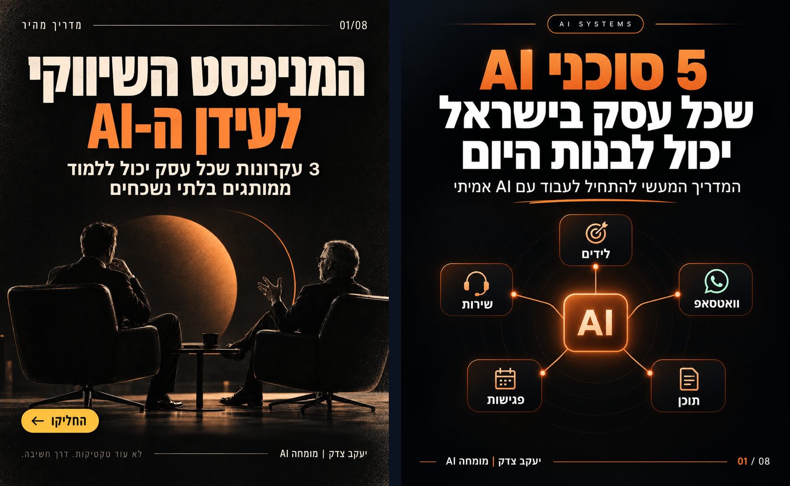
Opening slides for a carousel: one large headline, clear hierarchy, and accurate Hebrew inside the image (principles 4 and 10).
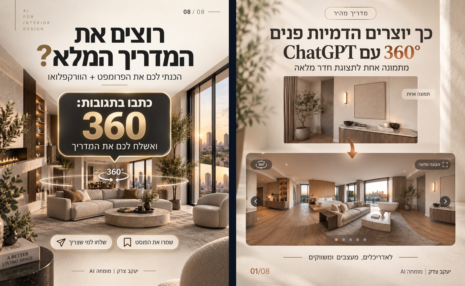
A complete carousel stays consistent when you lock the colors, font and style between slides and change only the content (principles 7 and 8).
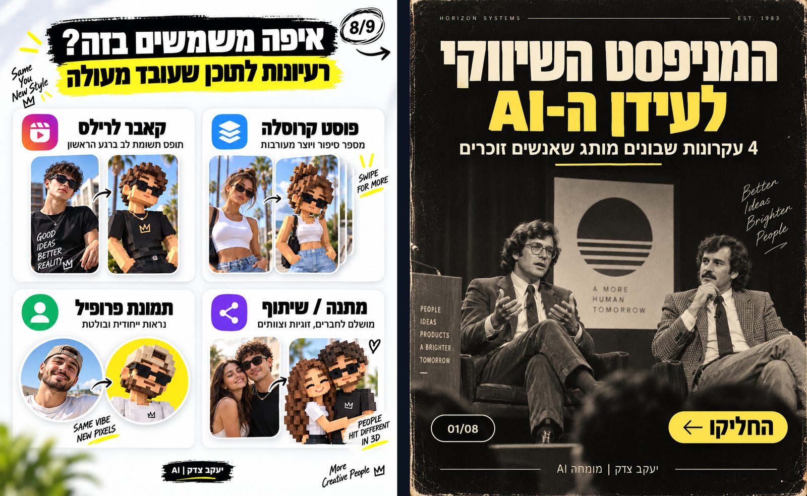
Same model, two completely different worlds: when you define a precise style instead of "something nice," you get a full design language (principle 6).
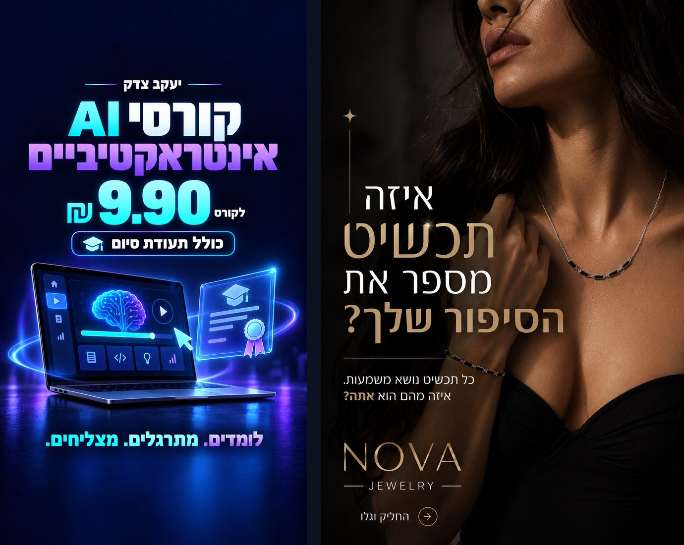
Vertical mobile format: one hero, lighting that leads the eye, and clean space for text and a button (principles 13 and 18).

Square podcast cover: a real person at the center, a headline that reads clearly even at icon size (principles 12 and 19).
First things first: don't ask for "a nice graphic"
This is probably the most common mistake. If you write "make me a nice ad for an AI course," you've given the model almost total freedom to decide for you: what style the graphic will have, what colors, where the headline goes, how much text there will be, what the background looks like, what font fits, what the central element is, and even what feeling the graphic is supposed to convey.
Sometimes you'll get something good. But you're essentially playing the lottery.
I prefer to think of Astra 6 the way I'd think about giving a brief to a very talented graphic designer. The clearer my brief, the better the chances of hitting what I have in mind.
Before you design: goal, one idea, and less
1. Start with the goal, not the design
Before I say a word about colors, fonts or images, I define what the graphic needs to do. For example:
"I need a Facebook ad that makes business owners stop scrolling and understand within two seconds that there's an AI tool here that can save them work."
That is far more powerful than "make an ad for an AI tool."
A graphic for a paid campaign needs to work differently from a book cover. A book cover needs to work differently from an Instagram post. And a SaaS hero page needs to work differently from all three. Before you ask for a design, define the job the design needs to do.
2. Give the graphic one central idea
One mistake I repeated myself early on was the urge to pack everything into the graphic: the product name, a headline, a subheadline, five benefits, a price, a promotion, a CTA, a logo, icons, an image, and three more elements "so it looks insane."
The result is usually the opposite. The more things you ask for, the less premium the graphic feels.
Today I almost always look for: what is the one thing the eye needs to see first? For example, if I'm promoting a GEO system, the central visual might be a person sitting in a control room with the brand appearing inside various AI systems on the screens in front of them. That's the story. Everything else needs to serve it.
A rule I use: one hero. One message. One action.
3. "Insane" does not mean "cluttered"
This is one of the most important things I've learned. When we tell the model "make something insane, futuristic, cyber, full of AI," the model might interpret that as more lights, more screens, more icons, more glowing lines, more text and more effects. The result is a graphic that looks like a sci-fi movie poster from 2014.
A graphic can be striking and still be clean. In fact, fewer elements plus one strong element very often equal a far more premium result.
I like to ask explicitly:
Dramatic and impressive, but not cluttered.
Premium minimalism.
Lots of negative space.
One dominant focal point.
Do not fill every empty area.
Don't be afraid of empty space. Empty space is part of the design.
Directing the graphic: hierarchy, composition and reference
4. Define hierarchy
Don't let all the text be the same size. I tell the model what needs to be seen first, second and third. For example:
- Main headline: Don't buy an AI course
- Secondary text: Until you see what you can do today with AI agents
- Small branding: Yaakov Tzedek | AI Expert
Once the model understands the hierarchy, the graphic starts to feel far more professional. You can even write:
The headline must dominate the composition. Everything else should be visually secondary.
A small instruction that makes a big difference.
5. Give composition instructions
This is probably one of the most important secrets. Don't just say what needs to appear, say where it goes:
- "The figure on the right, looking toward the center of the image."
- "Leave clean space on the left for the headline."
- "The logo small in the upper corner."
- "The CTA at the bottom."
- "The product centered and slightly angled."
Suddenly you're not just requesting an image. You're directing one. Instead of "a man sitting in front of an AI system," I can ask:
A man sitting on the right side of the frame in front of a large screen. The camera is slightly behind him, so you can see both him and the screen.
The screen is the central lit element. The left side of the frame stays relatively clean and dark to allow for a large headline.
Now the model has direction.
6. A reference is sometimes worth more than 500 words
One thing I use a lot is a reference image. If you've seen an ad, a website, a carousel, a cover, a logo or a composition you like, show it to the model.
But don't just say "make me one like this." Say what you like about it:
Take the structure, the amount of negative space, and the ratio between the headline and the figure. Do not copy the branding, colors or text.
A reference can explain something to the model in a second that would take you an entire paragraph to describe.
Branding, locking and revisions
7. Brand colors are not a suggestion
If your brand has a color, say so unambiguously. Not "maybe green would work," but: "The brand's primary color is green. Blue must not be used as a leading color." If you have a HEX code, even better: Use #XXXXXX as the primary brand color.
I also like to define a primary color, secondary color, background and accent color. And most importantly: what not to do. If you already received a blue version and you want a green one, don't just write "make it green." Write:
Keep the approved composition. Shift the color language toward green. Do not use blue.
Do not change the layout, typography or element placement.
8. When something works, lock it
This is probably the tip that saves me the most time. Say I received a graphic I like 90%, and there's one problem: the headline is the wrong color. I don't ask to recreate it. I say:
Keep the existing design exactly as it is. Change nothing except the headline color.
This matters a lot. Because if you write "great, now make the headline blue" without emphasizing what is locked, the model might also move the figure, swap the background, change the font and invent a new composition. That's why I use the principle: Lock what works. Change one variable at a time.
9. Don't fix ten problems at once
You got a first result. It almost never needs to be the last. But instead of "lower this, enlarge that, change the color, swap the font, move the logo, make it less cluttered and change the background," I prefer to work in layers:
- Round one: concept.
- Round two: composition.
- Round three: color.
- Round four: typography.
- Round five: small details.
This is exactly how you get from a 70% result to something that looks excellent.
Hebrew and typography
10. Hebrew requires special attention
AI has improved greatly at generating text inside images, but Hebrew still requires careful checking. You need to verify RTL direction, missing letters, substituted words, punctuation, alignment, line breaks, numbers and logos. Above all, don't settle for "that looks roughly right."
I recommend supplying the exact text inside quotation marks and adding:
Do not rewrite, translate or paraphrase the Hebrew text.
And if the text is long, it's better to shorten it, both for accuracy and for design. An ad is not an article. (I wrote about the tools that handle Hebrew inside images best in the Nano Banana guide and the Ideogram guide.)
11. Ask for a font that fits the brand, not "a nice font"
Typography completely changes the feel. The same design can feel cheap, technological, luxurious, childlike, governmental or startup-ish based solely on the font. Instead of "a nice font," I use descriptions like:
Modern clean sans-serif.
Premium technology brand typography.
Thin elegant typography.
Bold editorial headline.
Minimal Israeli tech aesthetic.
And when I don't like the result I say explicitly: "the font is too aggressive," or "I want something thinner, cleaner and more delicate." The model needs to understand the character, not just a font name.
Photography, Lighting, and Depth
12. If There Are People, Direct Them
If you're working with your own likeness or any other person, don't settle for "put Yaakov in the image." Think like a photographer: What is he doing? Where is he looking? What's the expression? Which part of the body is visible? What angle is the camera at? How does the light fall on him? For example:
Portrait from waist up, natural confident expression, looking slightly toward the interface rather than directly at camera, realistic studio lighting, subtle rim light.
The more you treat this like a real photo shoot, the less artificial the result will look.
13. Lighting Is One of the Things That Turn AI Into "Wow"
You can get the exact same scene in two versions, one mediocre and one stunning, purely because of the lighting. Words I like to use, depending on the style:
Cinematic lighting · Soft studio lighting · Rim lighting · Volumetric light
Soft shadows · Natural reflections · Subtle glow · High-end commercial photography
But again: don't throw all of them into every prompt. The lighting needs to match the concept.
14. Ask for Depth
Average AI graphics often look flat. I like to think in three layers:
- Foreground: Something close to the camera.
- Subject: The central element.
- Background: The world behind it.
For example: a small edge of a desk in the foreground, a person in front of a computer in the middle, a slightly blurred office in the background. That immediately creates depth. You can also ask for Strong depth separation, Shallow depth of field, or Subtle foreground elements.
15. Elements Should Belong to the World, Not Float Like Stickers
If I want to show Claude, Gemini, ChatGPT, or other AI tools, I don't always want five logos just hovering in the air. That looks like a PowerPoint. Instead, turn them into part of the scene: cards in an interface, information bubbles, screens, windows, reflections, subtle HUD layers. The goal is for the elements to feel like they belong to the world of the image.
16. Mockups Work Wonders
If you're promoting a SaaS platform, a book, an app, a course, a report, or a guide, sometimes the best way to make something feel like a real product is a mockup. Instead of a flat screenshot of a system, show it inside a laptop, desktop monitor, phone, tablet, or a subtle three-dimensional interface. Suddenly it feels like an actual product.
17. Define the Level of Realism
Don't let the model guess. If you want a photo, say so. If you want 3D, say so. If you want an illustration, say so:
Photorealistic commercial advertising.
Premium 3D product render.
Minimal vector illustration.
Editorial magazine design.
Cinematic technology campaign.
These are completely different worlds. (For vector illustrations and icons that can be scaled without losing quality, it's worth getting to know Recraft as well.)
Format, Mobile, and Logo
18. Define the Format Upfront
An Instagram graphic is not a website banner. I always think ahead about where the image is going to live: square post, Story or Reel, wide hero on a website, Facebook cover, YouTube thumbnail, mobile screen, or desktop screen. Don't create a design and then try to squeeze it into a different format. The composition needs to be born for the format.
19. Mobile Is Its Own Design Problem
This is especially important for websites and platforms. If you created a stunning hero for desktop, don't assume it will work on mobile. On mobile, the headline can move to the top, the figure can move to the center, secondary elements can disappear, the product can be larger, and the amount of text needs to come down. That's why I explicitly ask for:
Mobile version based on the same visual language, recomposed specifically for a vertical screen.
Not "shrink the desktop." Redesign for mobile.
20. The Logo Needs Room to Breathe
A common mistake is making the logo the central element. In most of the ads I create, it doesn't need to be. The logo should be legible, accurate, undistorted, a reasonable size, with space around it, and not competing with the headline. When I upload an existing logo, I also emphasize:
Use the supplied logo exactly as provided. Do not redesign or reinterpret it.
What Not to Ask For, and How to Define "Professional"
21. Negative Prompts: Say What You Don't Want
One of the most useful things you can do is explain what must not happen:
No clutter
No excessive neon
No random floating icons
No generic stock-photo aesthetic
No unnecessary text
No distorted logos
No fake UI text
No excessive gradients
No cartoonish look
No cheap sci-fi aesthetic
Sometimes the "don't" list is almost as important as the "do" list.
22. Don't Say "Make It Professional." Define What Professional Means to You.
"Professional" is a very general word. Instead, say:
Looks like a campaign from a premium global SaaS company.
High-end editorial advertising.
Minimal Apple-like product presentation.
Modern Israeli technology startup.
You're giving the model a visual world to understand what you're looking for.
My Method for a Good Prompt
23. The Structure: Goal, Format, Concept, Composition, Text, Brand, Style, Lighting, Constraints
I like to think about a graphics prompt using this structure. For example:
| Layer | What I wrote |
|---|---|
| Goal | Instagram ad promoting an AI platform |
| Format | Square graphic |
| Concept | A manager sitting in a control room watching their brand appear in AI engines |
| Composition | Person on the right. Large screen in the center. Clean space on the left for the headline |
| Text | One short headline only |
| Brand | Dark green and light green. Small logo |
| Style | Premium futuristic SaaS campaign |
| Lighting | Cinematic but clean |
| Constraints | Not cluttered, no dozens of icons, no blue, no random text |
Just from this structure you can get far more consistent results.
24. A Master Prompt You Can Take and Use
Here's a template I recommend saving:
Create a graphic for [the product/brand].

The purpose of the graphic is [the goal].

The format is [Instagram / Story / Hero / Banner, etc.].

The core visual concept:
[Scene description].

Composition:
[What is on the right / left / center / where space is left open].

The first element the eye should see:
[Hero].

The text to appear:
'[exact text]'

Do not alter, translate, or invent additional text.

Brand colors:
[colors].

Style:
Premium, modern, clean, high-end commercial design.

Typography:
Modern clean typography with clear visual hierarchy.

Lighting:
[type of lighting].

The graphic should be impressive but minimalist, with generous negative space and a clear hierarchy.

Avoid:
clutter, excessive effects, random floating elements, unnecessary text, distorted logos, generic stock aesthetics and cheap-looking AI design.
If you want to understand in depth why this structure works across every AI tool, not just for graphics, the guide to writing a good prompt is the natural next step.
25. The Real Trick: Stop Looking for the One Shot
People see stunning AI-generated graphics and assume there was one magic prompt behind them. In most cases, the genuinely good work looks different: we created, looked, removed, shifted, changed the font, swapped the color, reduced the text, cleaned up the background, changed the composition, locked down what was working, and only fixed what wasn't.
AI doesn't eliminate the design process. It turns you into the creative director. That's a massive difference.
26. The Lines I Use Over and Over
If you want to meaningfully improve your output, save the following:
- "Less text."
- "Less cluttered."
- "Keep the existing composition."
- "Don't change anything except..."
- "The font is too aggressive."
- "Make the typography cleaner and more refined."
- "Leave more empty space."
- "This element should be the central focus."
- "Don't add elements I didn't ask for."
- "Keep exactly to the brand colors."
Use the supplied logo exactly as provided.One dominant focal point.Strong visual hierarchy.Premium, clean and modern.Dramatic, but not cluttered.Do not fill every empty area.
These sound like simple instructions. But those simple instructions are often the difference between an AI image and a creative you'd actually run in a campaign.
27. My Checklist Before Approving a Graphic
Before I say "perfect," I check:
- Within two seconds, is it completely clear what I'm looking at?
- Is there one element pulling the eye?
- Is there too much text?
- Do the colors actually belong to the brand?
- Does the font match the character I want to convey?
- Is the logo accurate?
- Is the Hebrew completely correct?
- Does anything look like cheap AI?
- Can I remove one more thing without hurting the message?
That last question is especially important. You can almost always remove something.
Frequently Asked Questions
How do you write a good prompt for graphics in Astra 6?
Write a brief, not a general request: goal, format, one central concept, composition (what's on the right, left, and center), the exact text, brand colors, style, lighting, and a list of things not to do. The full template is in section 24.
Why do AI graphics look cluttered and cheap?
Because requests like "mind-blowing" or "futuristic" get interpreted as more lights, screens, icons, and effects. Ask explicitly for clean and dramatic, with generous negative space and a single focal point, and add a "without" list such as No clutter and No random floating icons.
How do you get correct Hebrew text inside an AI image?
Provide the exact text in quotes, add "Do not rewrite, translate or paraphrase the Hebrew text," keep it as short as possible, and check the direction, missing letters, punctuation, line breaks, and numbers before approving.
How do you fix a graphic without the model changing everything?
Lock what's working and change one variable at a time: "Keep the existing design exactly as it is. Don't change anything except the headline color." Work in rounds: concept, composition, color, typography, then details.
Do you need a reference image?
Not necessarily, but a reference explains in a second what takes a paragraph to describe. Say what to take from it, such as the layout, the amount of negative space, and the ratio between the headline and the figure, and what not to copy: branding, colors, and text.
How do you adapt the same graphic for mobile?
Don't shrink the desktop version. Ask for a version based on the same visual language, recomposed for a vertical screen: headline at the top, larger product, less text, fewer secondary elements.
The bottom line: The secret isn't Astra 6
Astra 6 can produce stunning results. But the tool is only part of the equation. The truly important skill is knowing how to look at a result and say: what exactly bothers me here?
Not "I don't like it." But rather: the font is too heavy. There isn't enough white space. The eye doesn't know where to look. The color doesn't belong to the brand. The figure is too large. There are too many icons. The text is competing with the product.
The moment you know how to identify these things and give the AI precise instructions, you stop being someone who "asks AI for images." You become the creative director of the AI. And in my view, that's one of the most important skills worth learning right now.
Want to practice this hands-on rather than just read about it? The interactive prompts course for 9.90 ILS teaches the same thinking around briefs, locking elements, and revision rounds, with exercises and a certificate. There are also dozens of short courses in the interactive courses library.
Yaakov Tzedek AI expert, lecturer, and AI implementation consultant for organizations
Frequently asked questions
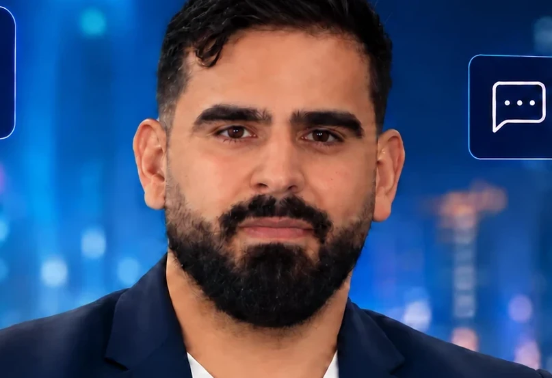
Yaakov Tzedek
An Israeli AI lecturer, consultant and implementer who has supported 100+ organizations in AI implementation and lectured for 200+. Official content partner of Meta, Google, Canva and TikTok, featured on Israel's Channel 13.
More about Yaakov →